
CivicSearch
Making local government transparent and searchable
Overview
A civic technology platform that aggregates and indexes city council meeting transcripts across the US and Canada, making local government proceedings searchable and accessible to citizens, policymakers, researchers, and journalists.
Technologies
Context & Challenge
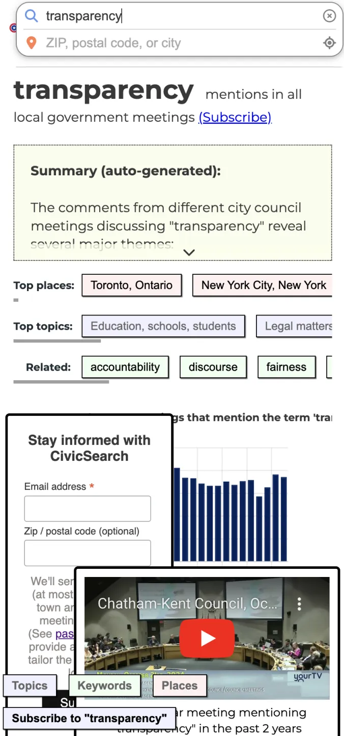
CivicSearch is a civic technology platform that aggregates and indexes city council meeting transcripts across the US and Canada. As local journalism continues to decline, this platform serves as a critical tool for citizens, researchers, policymakers, and journalists to access information about local government decisions affecting their communities.
However, the original platform suffered from complex information architecture with a steep learning curve, poor mobile experience, and significant performance issues when handling large transcript datasets. Through initial user research and heuristic evaluation using Nielsen's usability principles, I identified key barriers: unclear search affordances, inadequate mental models for exploring governmental discourse, and high cognitive load due to poor information architecture.
User Pain Points
Citizens struggled to formulate effective queries when searching for local government information, often not knowing what terms to use or how government proceedings are structured.
Researchers found it difficult to explore relationships between different governmental documents, meetings, and topics across multiple locations.
The mobile experience was nearly unusable, with critical navigation elements hidden or broken on smaller screens, preventing access for users on-the-go.
Technical Challenges
Performance bottlenecks caused slow page loads (4.2s average), especially when rendering large datasets of meeting transcripts.
Unnecessary re-renders throughout the deeply-nested component tree impacted responsiveness and user experience.
Complex state management patterns led to difficult-to-maintain code, increased bug surface area, and challenges with data synchronization.
Navigation Hierarchy

Phase 1: Platform Redesigned
As UX Engineer and Full-Stack Developer, I led a comprehensive platform redesign addressing critical usability barriers and technical debt. Through heuristic evaluation, I identified severe violations in system-user mental model alignment, flexibility, and status visibility. This dual-focus effort prioritized performance optimization, mobile responsiveness, and information architecture redesign to reduce cognitive load and improve task completion rates.
Leveraging performance optimization techniques from the "Fluent React" text, I implemented strategic rendering optimizations using Context API to prevent unnecessary component re-renders in deeply nested hierarchies. Integrated SWR for efficient data fetching with built-in caching, automatic revalidation, and optimistic UI updates. To address the steep learning curve identified in user research, I developed a fully custom, reusable component system with an icon-based token architecture that provides clear visual affordances and consistent interaction patterns across the platform, significantly improving discoverability and reducing development friction for future feature additions.
Adopting a mobile-first approach based on usage analytics, I restructured the interface using progressive disclosure and responsive design patterns. This component-driven architecture ensured critical content remained accessible on smaller viewports while maintaining feature parity across devices. Built modular, composable components with flexible grid layouts and touch-optimized interaction targets to support the platform's primary mobile user base, improving learnability, efficiency, and long-term maintainability across all device contexts.
Redesigned Search Result

Mobile-First Responsive Redesign

- Before: Hidden navigation, inadequate touch targets, content overflow issues
- After: Mobile-first design with accessible navigation, optimized touch targets, and responsive layouts
Phase 2: Search Interface Redesign (Proposed)
Building on the platform improvements, I conducted a comprehensive UX research cycle to reimagine the future of the search experience. This phase followed Design Thinking methodology, moving systematically through empathy, definition, ideation, prototyping, and validation.
The core problem identified through research: users needed to bridge exploratory and directed search paradigms. Citizens often don't know what they're looking for until they see it (exploratory search), while researchers need precise filtering capabilities (directed search). The solution needed to serve both use cases effectively without overwhelming either group.
Design Thinking Process & Artifacts


Proposed Search Interface Features
- 1
Natural language query input with intelligent auto-suggestions and syntax learning, reducing cognitive load while teaching advanced search patterns through progressive disclosure
- 2
Visual relationship mapping via interactive node graphs exposing hierarchical connections between Topics, Keywords, Places, and Speakers, improving discoverability and mental model alignment
- 3
Flexible filtering system with pill-based query construction supporting both novice exploration and expert precision search
- 4
Dynamic result clustering with AI-generated summaries providing high-level context before drilling into individual meeting transcripts, reducing information scent loss