
GlitchTip - Open Source Error Tracking & Performance Monitoring
Applying Lean UX principles to modernize error monitoring interfaces for development teams
Overview
Software engineering role focused on user-centered design and requirements scoping for an open-source error tracking platform, translating community feedback and stakeholder needs into actionable technical improvements. Led frontend modernization efforts by migrating legacy Angular components to Angular Material 3, while redesigning information architecture to increase data density and improve mobile responsiveness for on-the-go incident management.
Technologies
Context & Challenge
Open-source error tracking platforms often suffer from inconsistent UI patterns, information overload, and poor mobile experiences, making it difficult for development teams to efficiently monitor and resolve issues across devices and contexts.
As a small team operating with limited resources, GlitchTip needed to balance rapid iteration with maintaining high UI/UX standards. The challenge was to modernize the interface while ensuring changes solved real user problems rather than simply adding features.
Working in an open-source environment required a unique approach: scoping user needs by analyzing community PRs, GitHub issues, and feature requests to identify pain points and prioritize improvements that would deliver maximum impact for the diverse user base.
User Pain Points
Developers struggled with inconsistent page layouts and lack of visual hierarchy—pages had no padding between headers and content tables, creating jarring transitions when navigating between views.
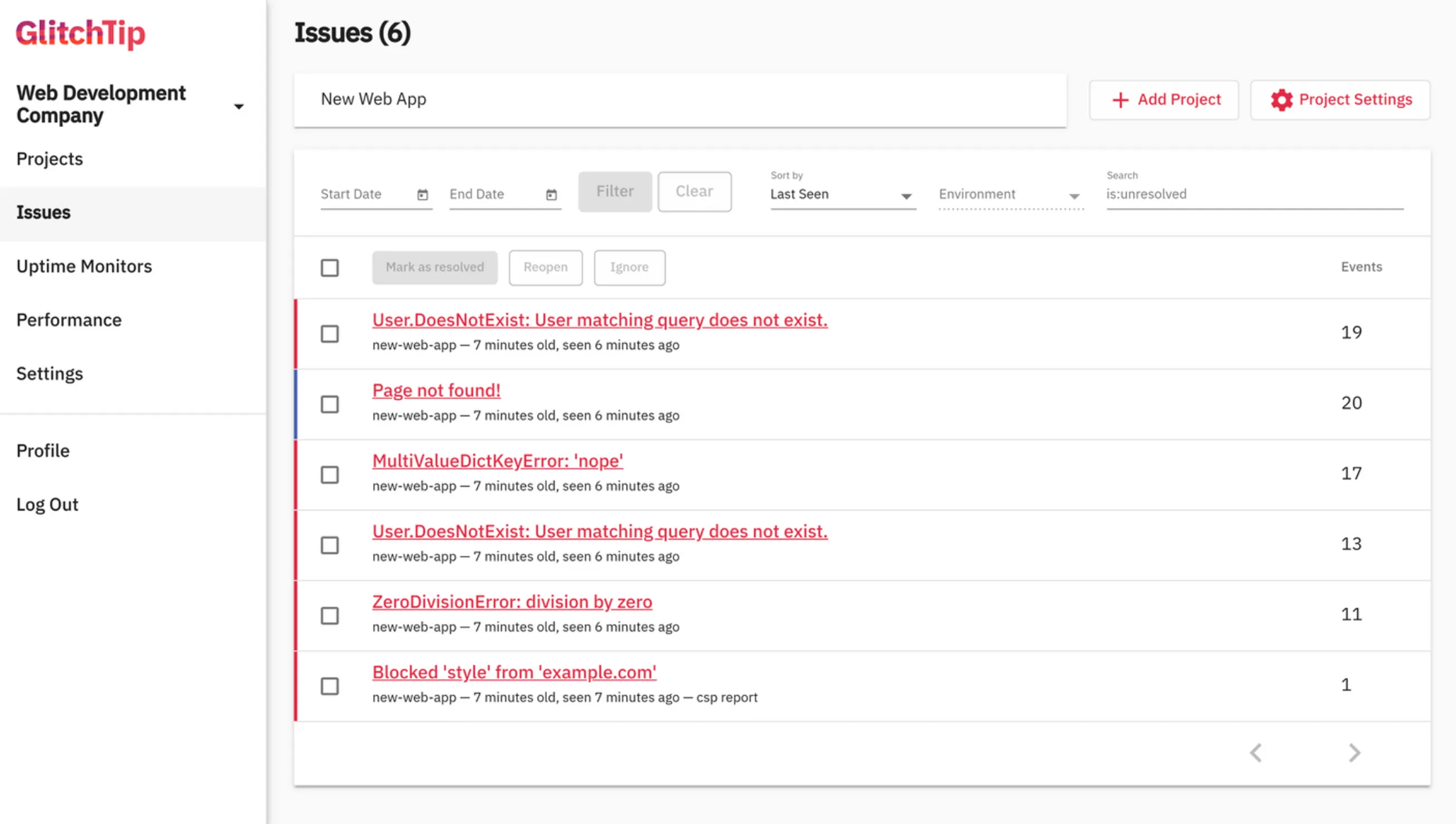
Low information density on smaller screens limited the number of visible issues, forcing excessive scrolling and reducing monitoring efficiency on mobile devices.
Overly complex interaction patterns throughout the platform created cognitive overhead and uncertain outcomes. For example, state management required navigating three separate buttons with no immediate feedback, leaving users uncertain if their actions had taken effect.
Repetitive, frustrating navigation flows disrupted common workflows. Issues like bottom-placed pagination controls that forced scroll-down-jump-back patterns exemplified broader usability problems across the interface.
Technical Challenges
Migrating legacy Angular components to Angular Material 3 while maintaining backward compatibility and avoiding breaking changes for existing users.
Designing a top app bar system to contain top-level hierarchy actions and create consistent layouts across all views.
Solving structural inconsistencies like variable table heights that created disjointed experiences with vastly different page layouts depending on content volume.
Balancing rapid prototyping with maintainability constraints of a small development team—solutions needed to be easily reusable within the Angular Material component system.
Approach: Lean UX & Iterative Refinement
Applied Lean UX principles to drive product improvements through continuous user feedback and open-source collaboration. By analyzing GitHub issues, PR requests, and community discussions, I identified recurring pain points around layout consistency, interaction complexity, and information density—then prioritized solutions that addressed root causes rather than surface-level symptoms.
Worked iteratively to redesign core interaction patterns and information architecture across the platform. This included implementing a consistent top app bar system to standardize page layouts, redesigning table architecture with fixed heights and internal scrolling to maintain visual consistency, and simplifying complex user flows throughout the application.
As both software engineer and UX designer, I rapidly prototyped component solutions within Angular Material's constraints, ensuring all improvements remained maintainable for the small development team. Each iteration focused on solving specific user problems identified through community feedback while building toward a more cohesive, scalable design system.
Increased information density strategically through icon usage and collapsible systems, including a new collapsible navbar that maximizes screen real estate. Simplified interaction patterns to reduce cognitive load—for instance, replacing multi-button state controls with intuitive segmented buttons that provide immediate visual feedback, and relocating pagination to eliminate frustrating navigation patterns.
Simplified Interaction Patterns
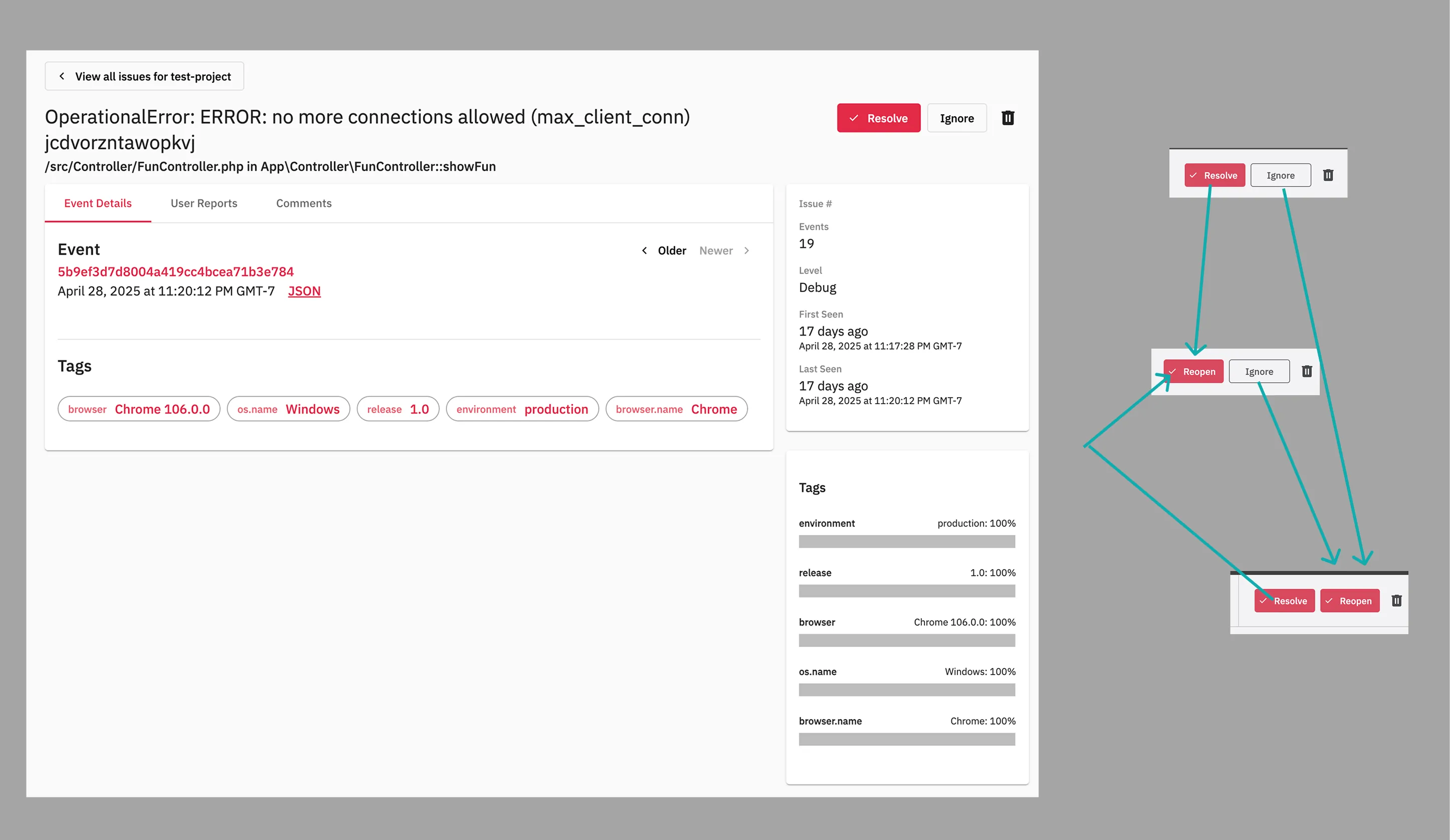

- Before: Example of unnecessarily complex interactions—three separate buttons for state changes with no immediate feedback, representing broader usability issues throughout the platform
- After: Simplified segmented button with immediate icon-based feedback, exemplifying the systematic reduction of interaction complexity across the interface
Consistent Layouts & Information Density
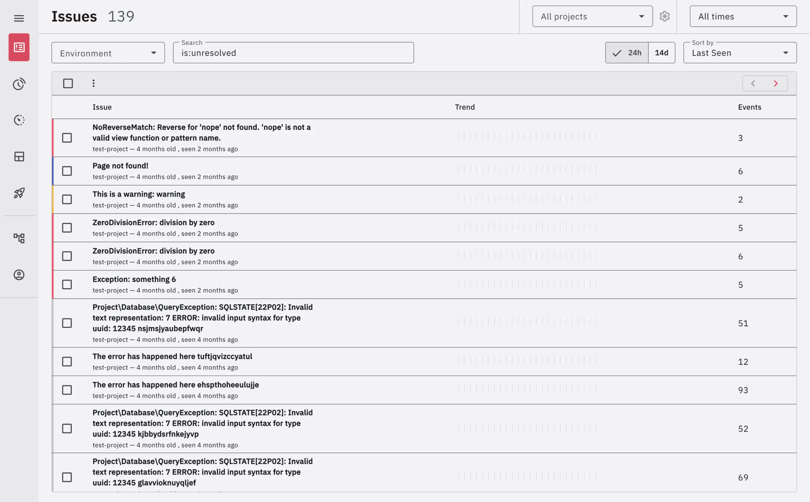
- Before: Variable table heights, inconsistent spacing, and low information density exemplifying structural problems that created disjointed user experiences across pages
- After: Fixed-height tables with internal scrolling, consistent spacing system, and increased information density through strategic design decisions applied systematically across the platform
Impact & Ongoing Collaboration
Through continuous iteration based on community feedback, contributed dozens of improvements addressing layout consistency, user flow simplification, and information density optimization. The redesigned architecture now provides developers with a more intuitive, efficient error monitoring experience across all device sizes.
As a software engineer working within the constraints of a small development team, all solutions prioritized maintainability and reusability within Angular Material's design system. This approach ensured the platform could continue evolving sustainably as an open-source project.
The systematic redesign of interaction patterns and information architecture reduced cognitive load during critical error triage workflows while maintaining scannability. Consistent visual hierarchy and predictable mental models now work cohesively across all views, enabling faster issue resolution and more confident decision-making.